OHellNo
Brand Strategy
Verbal Identity
Visual Identity
OHellNo
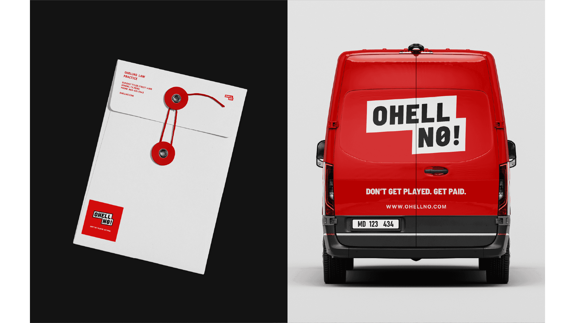
Most legal brands promise dignity. OHellNo promises fire. This is a personal injury firm for clients who are done being quiet about it. The brief was clear: no corporate restraint, no courthouse theatrics, no visual language borrowed from the industry that wronged the people they represent. We built a brand that says "this stops here" before anyone reads a word.

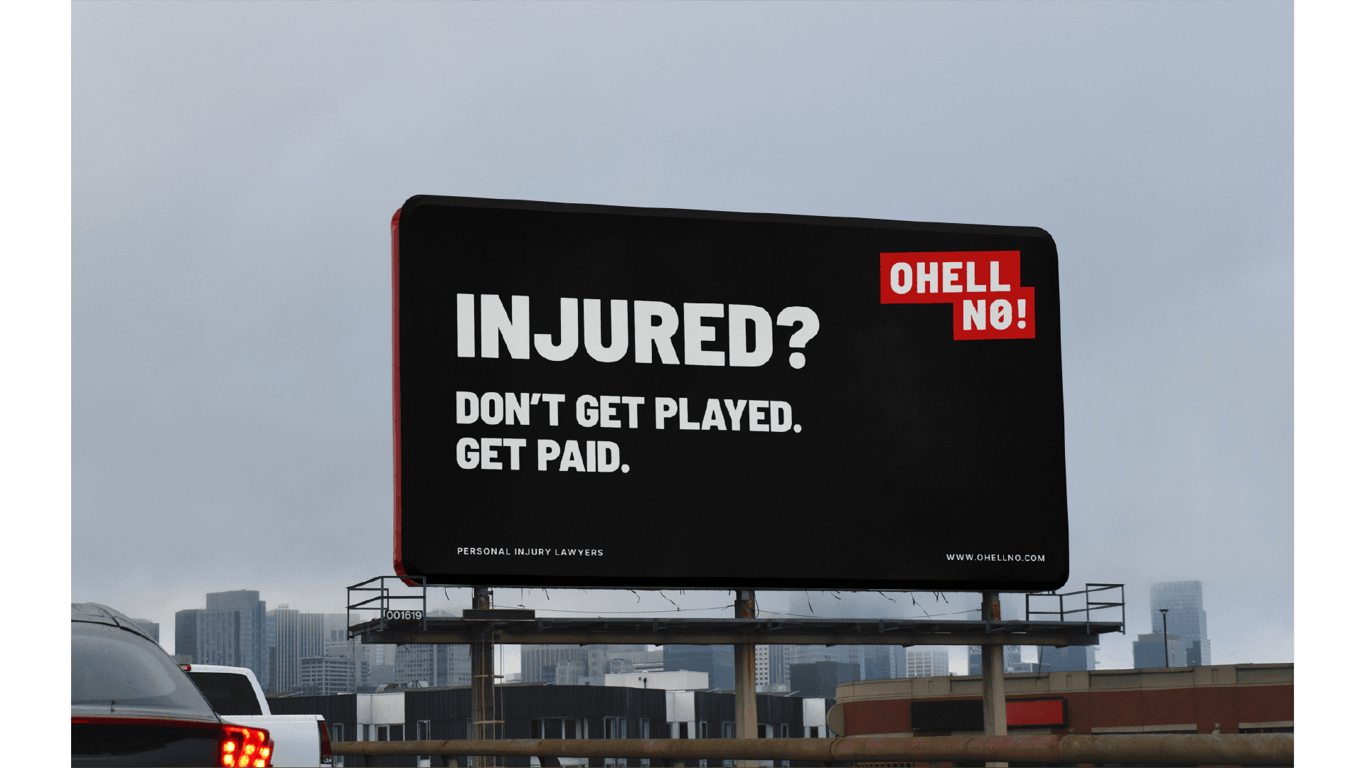

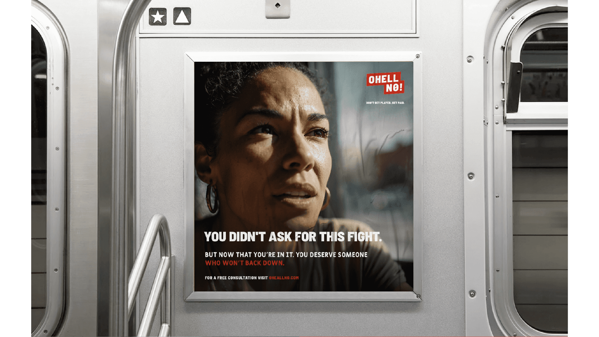
The identity is rooted in defiance made visible. A stacked wordmark with a slashed zero transforms frustration into a graphic act. Emergency red paired with high-contrast typography signals urgency, refusal, and the visceral confidence of someone who knows they're right. The photography direction follows suit: real people, real expressions, documentary light. Nobody rescued, nobody small.
The result is a law firm that looks exactly like what it feels like to finally have someone in your corner.